Colour behaves differently under Pakistan's strong sunlight and dusty air. This guide presents proven colour schemes for drawing rooms, bedrooms, kitchens and compact apartments, with practical advice on paint finishes and undertones.
A colour that looks elegant in a European showroom can look completely wrong in a home in Islamabad or Karachi. The reason is light. Pakistan receives intense, warm and highly directional sunlight for most of the year, which amplifies yellow and orange undertones and washes out delicate pastels. Add high airborne dust levels in many cities, long summers that make dark rooms feel oppressive and a cultural preference for bright, welcoming guest spaces, and it becomes clear that colour selection here needs its own logic.
This guide sets out colour schemes that consistently perform well in Pakistani homes, along with the practical reasoning behind them. The aim is not to follow a passing trend but to help you choose combinations that stay attractive under real conditions and remain easy to maintain.
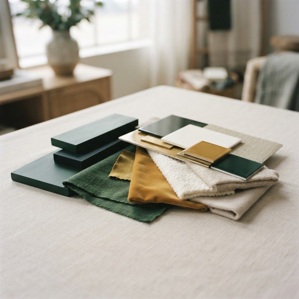
Colour is one of the hardest decisions to make from a sample card, which is why our Interior Design and Fit Out division at Living Solutions Global tests palettes in context. We prepare large scale samples, view them in your own rooms at different times of day, and coordinate wall colours with flooring, joinery, upholstery, curtains and lighting temperature so nothing clashes once installed. This process removes the guesswork that leads to repainting entire homes after handover.
Our residential interior design service treats colour as part of a complete material scheme rather than an isolated choice, and our wider interior design in Pakistan team supports clients across the country. Many households prefer to discuss room by room preferences with a woman on the design team during home visits, and for those clients we offer a female interior designer in Islamabad who can lead the consultation.
Every neutral leans either warm or cool. Warm neutrals contain traces of yellow, red or brown, while cool neutrals lean towards blue, green or grey. In strong Pakistani daylight, cool greys often turn flat and slightly blue in the afternoon, whereas warm neutrals hold their character. This is why greige, sand, oat, mushroom and soft clay tones perform so reliably in local homes.
Match your undertone across surfaces. A warm cream wall next to a cool grey tile will always look slightly wrong, no matter how good each element is individually. Consistency of undertone is more important than exact colour matching.
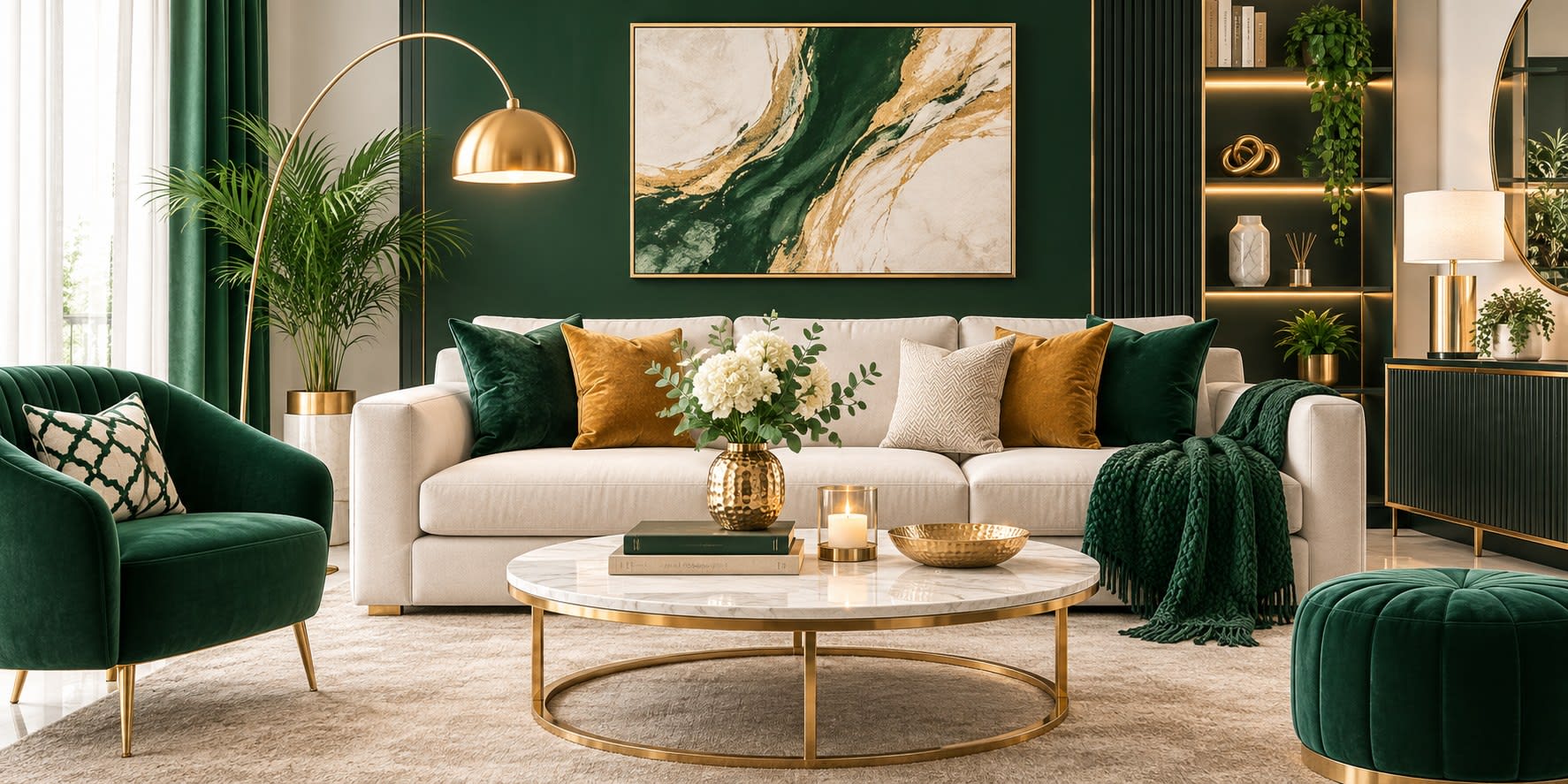
A soft warm off white on the main walls, a deep forest green on one feature wall or on joinery, and brass or antique gold accents create a scheme that feels calm, current and quietly luxurious. Green sits comfortably with Pakistani daylight because it echoes garden foliage, and it pairs naturally with wooden furniture found in most homes.
This combination works especially well in drawing rooms and formal dining spaces. Keep the green to one third of the visible surface at most, and balance it with generous off white so the room never feels heavy.
Earth tones suit the local climate and landscape beautifully. Use a sand or oat base on walls, introduce terracotta or burnt clay through upholstery, cushions and rugs, then anchor the scheme with charcoal in curtain fabric, metal frames or a single dark cabinet. The result feels grounded and warm without becoming dull.
This palette is forgiving with dust, hides minor marks well and photographs beautifully in daylight, making it a strong choice for family living rooms and open plan spaces.
For homeowners who prefer a classic feel, ivory walls combined with walnut or teak wood and a muted dusty blue accent produce an elegant traditional scheme. The wood provides warmth, the ivory keeps the space bright and the blue introduces freshness without the coldness of a pure grey palette.
Use the blue sparingly through curtains, an accent chair or ceramic accessories. In bedrooms this combination creates a restful atmosphere that still feels rich rather than plain.
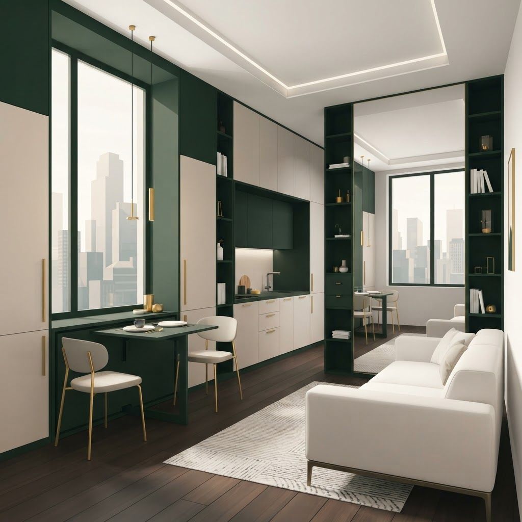
Compact apartments benefit from tonal simplicity. Choose a single warm grey and use three shades of it, lightest on walls and ceiling, mid tone on larger furniture and darkest on a rug or feature element. Add texture through boucle fabric, ribbed wood panelling and matte ceramics to prevent flatness, then introduce one warm metal such as brushed bronze.
Because the palette is unified, the eye moves without interruption and even small rooms read as larger and more considered.
For homes with limited natural light, a clean warm white on all walls and ceilings maximises reflected light. Bring in life through plants, botanical prints, woven baskets and natural jute or cane furniture. The greenery supplies colour that changes with the seasons while the shell remains bright and open.
Choose a white with a subtle warm base rather than a stark bright white, which can feel clinical under artificial lighting in the evening.
Drawing rooms should feel welcoming and slightly formal, so a light dominant tone with one confident accent works best. Family lounges can carry deeper and richer colours because they are used in the evening and benefit from a cosier feel. Bedrooms respond well to soft muted tones, and it is wise to avoid highly saturated colours on the wall behind the bed. Kitchens perform best with light upper cabinets and darker lower cabinets, which keeps the space bright while hiding wear at floor level. Bathrooms feel larger with a continuous light finish and one contrasting element such as a stone counter or a textured feature wall.
Finish matters as much as colour. Matte and low sheen emulsions hide wall imperfections and look sophisticated, but they mark more easily and are harder to clean. Eggshell and satin finishes offer a practical balance for corridors, children's rooms and stairwells where surfaces get touched frequently. Reserve gloss for joinery, doors and trim, where its durability is genuinely useful.
In dusty cities, washable emulsions are worth the additional cost because walls can be wiped rather than repainted every year.
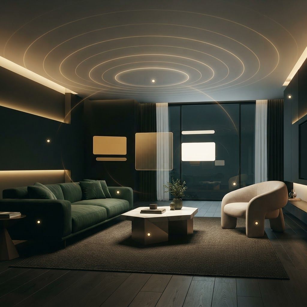
Artificial light changes colour dramatically. Warm white lamps push beige and cream towards yellow, while neutral white lamps make greys appear cleaner and cooler. Decide your lighting temperature and your wall colour together, and always check samples under the actual fittings you plan to install. A palette approved only in daylight often disappoints after sunset.
Do not choose colour from a small swatch, because colour intensity increases significantly across a large wall. Do not paint before selecting flooring and upholstery, since paint is the easiest element to match and should be decided last. Avoid using more than one accent colour per room, and resist the temptation to give every room a different scheme, which makes a home feel disconnected. Finally, remember that ceilings do not have to be pure white, and a shade slightly tinted towards the wall colour often looks more refined.
The best colour scheme for a Pakistani home is one that respects local light, suits your maintenance realities and connects every room through consistent undertones. Warm neutrals with a single deep or earthy accent remain the most reliable formula, and simplicity nearly always outperforms variety. If you would like help testing palettes in your own home and coordinating them with materials and lighting, our design team can guide the process from first sample to final coat.

Written by the Living Solutions team
Strategy, design, and trade expertise, all under one roof.
Let's discuss how we can turn your vision into sustainable growth and measurable success.