Discover how colour shapes mood, behaviour and perception in interior spaces. This guide explores the psychology behind palettes and how to apply it to homes and workplaces.
Colour is one of the most powerful tools in interior design. Long before we notice furniture or finishes, we respond emotionally to the colours around us. A calming palette can lower stress, an energising scheme can boost focus, and a warm tone can make a large space feel intimate. Understanding colour psychology allows designers to shape not just how a room looks, but how it makes people think, feel and behave within it.
At Living Solutions Global we treat colour as a strategic design decision, not an afterthought. Our interior design in Pakistan team studies how each space will be used, who will occupy it and what mood it should evoke, then builds a palette that supports those goals. From serene family homes to productive corporate floors, we use colour to create environments that feel intentional and emotionally resonant.
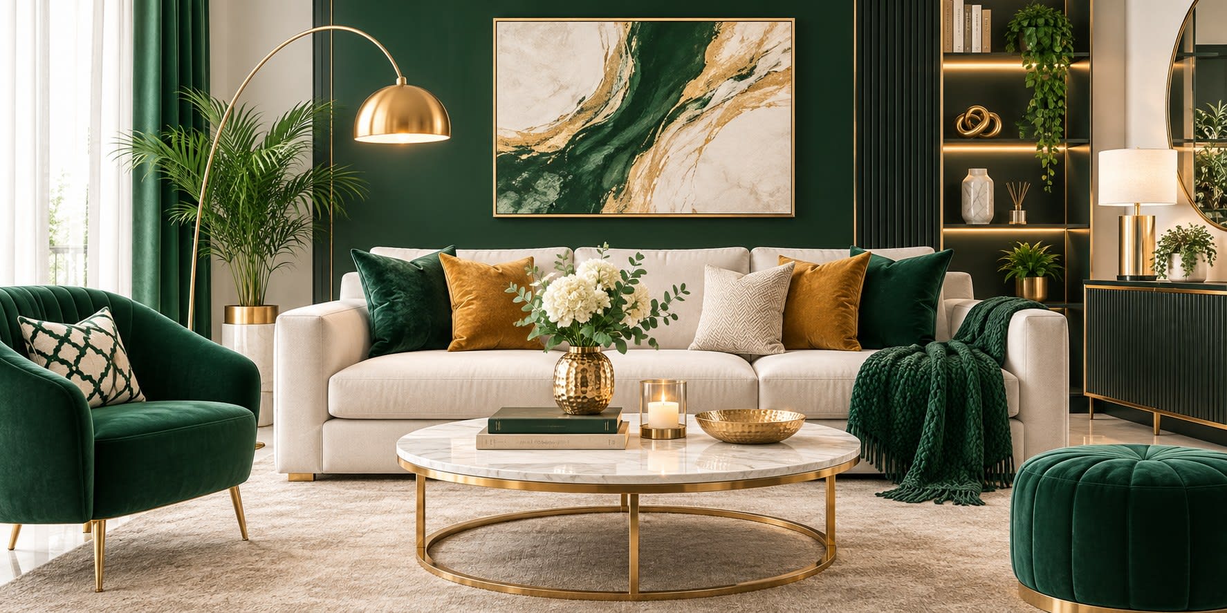
Every colour carries associations that influence perception. Blues and greens evoke calm, trust and balance, making them ideal for bedrooms, wellness spaces and focused work areas. Reds and oranges stimulate energy and appetite, suiting dining spaces and social zones. Yellows bring optimism and warmth, while neutrals such as beige, taupe and soft white create a grounded, timeless backdrop. Recognising these emotional cues helps designers match colour to purpose.
Colour temperature dramatically affects the feel of a room. Warm tones advance visually, making spaces feel cosier and more welcoming, which is useful in large or sparse rooms. Cool tones recede, creating a sense of openness and calm that benefits compact or busy spaces. Skilled designers balance the two, using warm accents to soften a cool scheme or cool undertones to keep a warm palette from feeling overwhelming.
In homes, colour should reflect the personality and rhythm of the people living there. Restful blues and soft greens suit bedrooms, while inviting earthy tones enrich living and dining areas. Kitchens often benefit from clean, fresh palettes that feel hygienic and bright. Because homes are lived in around the clock, our residential interior design approach considers how colours shift under morning daylight and evening lamplight to ensure they feel right at every hour.
In professional environments, colour directly influences productivity, brand perception and wellbeing. Blues and greens support concentration and reduce fatigue, making them popular in focused work zones. Energetic accents in brand colours can enliven collaborative areas and reception spaces, reinforcing identity and leaving a strong impression on visitors. Our commercial interior design work uses colour to align physical space with company culture and goals.
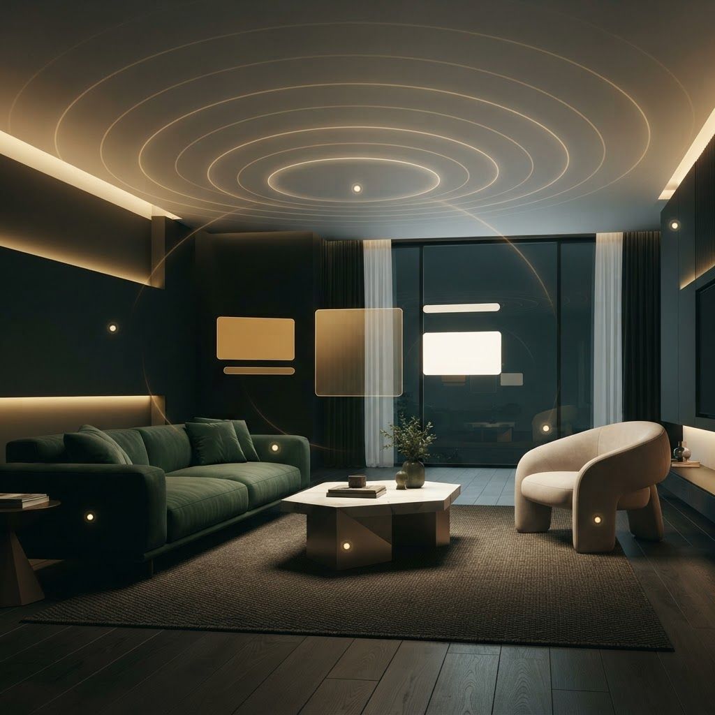
Colour never exists in isolation. Natural and artificial light transform how a shade appears throughout the day. A paint that looks soft and warm in daylight can turn cold or muddy under poor artificial lighting. That is why colours must always be tested in the actual space, on large samples, under the lighting conditions the room will experience. This prevents disappointing surprises and ensures the intended mood is achieved.
A well composed palette usually follows a simple rhythm: a dominant colour across walls and large surfaces, a secondary colour for furniture and joinery, and an accent colour used sparingly to add energy and focus. Neutrals provide breathing space and prevent visual fatigue. This layered approach keeps interiors cohesive while allowing personality and contrast to shine through in considered doses.
Colour meaning is also shaped by culture and context. In Pakistan, rich jewel tones, warm earthy hues and elegant metallic accents carry strong cultural resonance and a sense of hospitality. Blending these traditional sensibilities with contemporary design creates interiors that feel both modern and rooted in local identity, a balance we bring to every project across Islamabad and beyond.
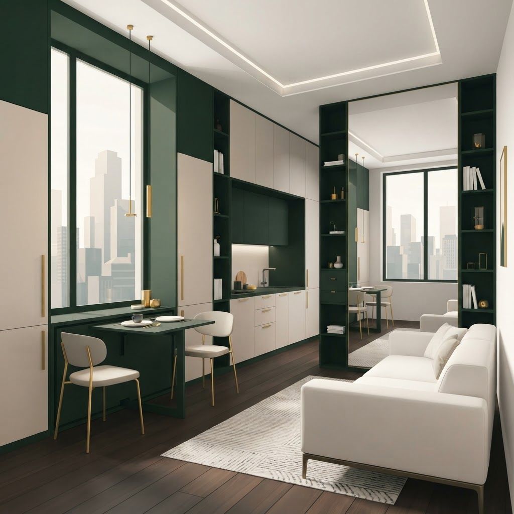
Beyond emotion, colour is a practical tool for reshaping how a space is perceived. Light colours make small rooms feel larger and more open, while darker tones create intimacy and drama in expansive areas. Painting a ceiling a lighter shade than the walls draws the eye upward, making a room feel taller, whereas a darker ceiling lowers it for a cosier effect. Continuous colour across walls and joinery can make a compact space feel seamless and calm. Understanding these visual tricks allows designers to correct proportions and enhance the sense of space without a single structural change.
Even beautiful colours can fail when applied without care. Choosing a shade from a small paint chip rather than a large sample, ignoring how a colour behaves under different lighting, or overloading a room with too many competing tones are frequent pitfalls. Trends can also tempt clients toward choices they may quickly tire of. A disciplined, considered approach, grounded in how a space will actually be used and experienced, avoids these mistakes. This ensures the final palette feels timeless, cohesive and genuinely suited to the people who live or work within it.
When applied thoughtfully, colour psychology turns ordinary rooms into spaces that support how people want to feel and function. By combining emotional insight, lighting awareness and cultural understanding, we craft palettes that elevate homes and workplaces alike. Talk to our team to discover how the right colours can transform your space.

Written by the Living Solutions team
Strategy, design, and trade expertise, all under one roof.
Let's discuss how we can turn your vision into sustainable growth and measurable success.