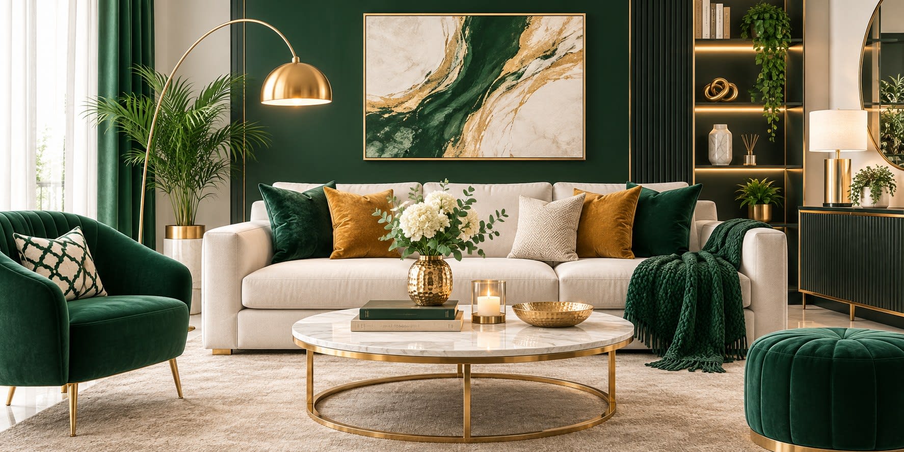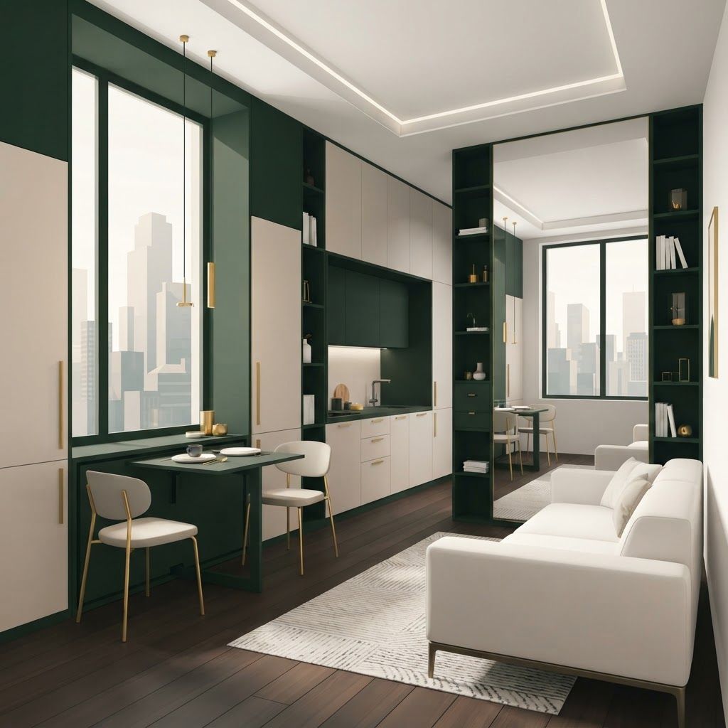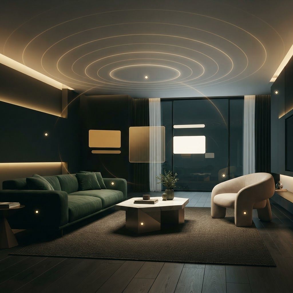
The reception is the first thing clients judge and the last thing they remember. These reception design ideas cover layout, counters, seating, lighting, branding and materials that hold up under daily commercial use.
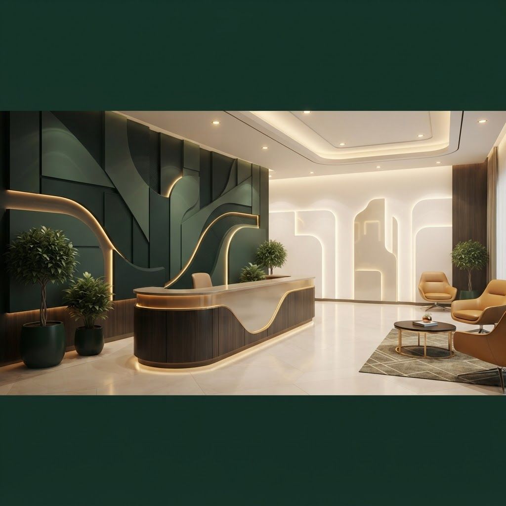
A visitor forms an impression of your company within seconds of walking through the door, long before anyone speaks. The reception area is where that judgement happens. It communicates whether you are organised or chaotic, established or improvised, premium or budget. For consultancies, law firms, clinics, real estate offices, export houses and technology companies alike, this small space carries a disproportionate share of the brand message.
Reception areas also perform hard practical work. They control access, manage waiting, handle deliveries and often accommodate a staff member for the entire working day. A beautiful reception that fails at these tasks becomes a daily irritation, so the best designs solve function and impression at the same time.
Our Interior Design and Fit Out team at Living Solutions Global treats reception as the centrepiece of every workplace project. We plan the arrival sequence, design custom counters with correct working heights and concealed storage, specify durable flooring and wall finishes, engineer feature lighting, and integrate signage that reflects your identity precisely. Because we deliver the work ourselves through our fit out services, the joinery, electrical, ceiling and finishing trades stay coordinated, and the completed reception matches the visuals you approved. Reception design also forms part of our wider office interior design scope for offices across Islamabad and the rest of Pakistan.
Before choosing materials, map the journey. A visitor enters, understands where to go, is greeted, waits briefly and is escorted onward. Each of these moments needs a physical answer. The entrance needs a clear threshold and a place to shed dust or rain. Wayfinding needs an obvious focal point, usually the counter and brand wall. Greeting needs a receptionist positioned to see the door without twisting. Waiting needs comfortable seating within sight of the counter. Onward movement needs a route that does not pass through working areas or storage.
Sight lines matter enormously. From the seated position a visitor should see something considered: a feature wall, planting or artwork, not a fire cabinet, a stack of files or a corridor of desks. Equally, confidential work should never be visible from the waiting area.
The counter is the most examined piece of joinery in your office, so it deserves proper detailing. Standard practice uses a lower working surface at roughly seventy five centimetres for the receptionist and a raised transaction ledge at around one hundred and ten centimetres facing the visitor, which conceals equipment and papers while providing a place for guests to sign or place documents.
Inside the counter provide drawers, a lockable cupboard, cable routing for the computer and telephone, power sockets and space for a small printer or scanner. Wrap the visible faces in veneer, high pressure laminate, solid surface or fluted timber, and protect the base with a recessed plinth or metal trim because feet and cleaning equipment will attack that edge relentlessly. Rounded or curved counters read as more welcoming than sharp rectangular blocks and survive knocks better.
The wall behind reception is prime brand real estate. Options that consistently look premium include a fluted or slatted timber panel with a backlit metal logo, a stone or large format porcelain panel with concealed edge lighting, a textured plaster finish with a brushed brass logo, or a green wall with the identity mounted in front. Keep the logo generously sized but leave breathing space around it, and light it separately from the ambient scheme so it reads clearly in photographs and video calls.
Resist the temptation to fill this wall with slogans, certificates and multiple graphics. One strong element outperforms five competing ones. If your identity itself needs refinement before it is fabricated in three dimensions, our branding services team can align the mark, colours and typography so the physical installation looks intentional.
Choose seating that is easy to rise from, upholstered in commercial grade fabric or quality faux leather, and arranged so strangers are not forced to sit shoulder to shoulder. Two or three armchairs with a side table usually feel more premium than a long bench sofa. Provide a small table, a water point or hospitality tray, and discreet power sockets so waiting guests can charge devices. A magazine or brochure rack with your own material keeps the space useful and on brand.
Add a mirror or reflective surface only where it does not compromise privacy, and include a coat or umbrella provision during monsoon and winter months. These small courtesies are noticed.
Reception lighting should be warmer and more layered than the general office. Use a decorative pendant or cluster above the counter or seating to create a focal point, downlights or linear profiles for even circulation light, and concealed strips to wash the brand wall and counter underside. Aim for a slightly warmer colour temperature than work areas so the space feels hospitable rather than clinical.
Avoid a single bright fixture directly above the receptionist, which creates harsh shadows and unflattering conditions for the person who sits there all day. Dimming control on the decorative layer allows you to adapt for evening events and photography.
Reception floors take the heaviest wear and the most dirt in the building. Large format porcelain, engineered stone or high grade luxury vinyl planks all perform well and clean easily. Add a recessed entrance mat to trap dust, which is a genuine issue in the capital. On walls use washable paint, wood veneer or panelling in impact zones, and protect corners with metal or timber trims.
Mix textures rather than colours for a sophisticated result: timber against stone, matte against gloss, soft upholstery against hard surfaces. Three materials handled well look more expensive than seven materials competing for attention.
Decide early how access control works. Options include a locked interleading door released by the receptionist, an access card reader, or a visible but supervised open plan route. Position cameras thoughtfully, conceal the intercom and alarm panels within joinery, and provide a secure place for keys and deliveries. Many offices also benefit from a visitor sign in system on a tablet mounted at the counter, along with a discreet display showing meeting information or company work.
Many Islamabad offices occupy converted sector houses or compact suites where the reception is genuinely small. In these cases use a slim counter or a hospitality style console instead of a bulk unit, mirror or glass to extend perceived depth, wall mounted seating to free floor area, and vertical emphasis such as a full height panel to draw the eye upward. Keep the palette light with one strong accent, and remove every unnecessary object, because clutter shrinks a small space faster than any wall.
A successful reception is planned as a sequence, anchored by one confident feature, lit in layers, built from durable materials and free of visual clutter. Get those elements right and visitors form a positive impression before a word is spoken, while the person who works there enjoys a practical and comfortable station. If you would like a designed reception concept and a transparent cost for your premises, our commercial interior design team can prepare drawings and visuals for your space.

Written by the Living Solutions team
Strategy, design, and trade expertise, all under one roof.
Let's discuss how we can turn your vision into sustainable growth and measurable success.